Logos, Branding, & Visual Identity
For 145 years, The King’s Academy has carried a faithful mission.
Our refreshed visual identity is more than a logo system. It is an expression of our heritage, our mission, our values, and the future we are stepping into together.
Some marks remain. Some have been refreshed. But what matters most stays the same.
The King’s Academy remains committed to being a Christ-centered community where students are known, loved, and equipped for life, leadership, and calling.
OUR VISUAL IDENTITY
The Logo Is Not the Story. It Reveals the Story.
A visual identity helps tell the world who we are. It gives clarity, consistency, and strength to the way The King’s Academy is represented across academics, athletics, admissions, student life, communications, and campus experiences.
This refreshed identity was created to honor where we have been while helping us move forward with purpose.
Our mission has not changed.
Our commitment has not changed.
Our story continues.
Formed by Mission. Guided by Values.
The King’s Academy is committed to being a Christ-centered community where students are known, loved, and equipped.
Our core values give language to the kind of students and community we are committed to forming.
Passion
Pursuing what God has placed before us with joy, purpose, and conviction.
Resilience
Persevering with courage when challenges come.
Integrity
Living with character, honesty, and conviction.
Devotion
Following Christ with faithfulness in life, learning, and calling.
Excellence
Doing our work with diligence and purpose for God’s glory.
The TKA Logo Family
Continuing Mark
Some marks remain because they still carry the strength, recognition, and history of The King’s Academy.
This mark continues to serve as an approved part of the TKA visual identity and may be used in settings where it is already recognized and appropriate.
Right-Facing Lion

The right-facing lion represents movement, courage, strength, and forward momentum.
This mark is bold, flexible, and ideal for spirit-driven applications across athletics, student life, apparel, banners, and school pride moments.
Front-Facing Lion

The front-facing lion gives The King’s Academy a confident and recognizable spirit mark.
It is designed for moments that call for strength, presence, and bold school identity.
Shield / Crest
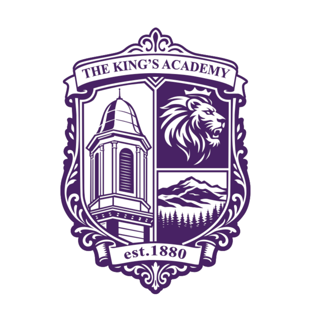
The shield and crest serve as a formal expression of The King’s Academy identity.
This mark reflects heritage, academic tradition, spiritual formation, faithfulness, and purpose.
Logo Usage Guidelines
Clear Space & Sizing:
Maintain open space around logo. Minimum width: 1 inch print, 150px digital.
Color Variations:
Use approved purple, gold, gray, black, or white noted below.
Do Not:
Stretch, tilt, recolor, or place over busy backgrounds.
Apostrophe Usage:
Always include the apostrophe in King’s (Psalm 24:1).
Naming:
Refer to us as The King’s Academy (first reference) and TKA thereafter (1 Corinthians 1:10).
Color Palette
TKA Purple
Representing Royalty in Christ (1 Peter 2:9)
TKA Gold
Representing Preciousness of Christian values (1 Corinthians 3:12)
TKA Black
Representing Depth of faith and history (Colossians 2:7)
TKA Gray
Representing Stability in Christ (Psalm 62:2)
Have Branding Questions?
Our communications office is here to help with logo usage, design requests, or custom applications! Email us at communications@thekingsacademy.net